Why does a flag work? Or — why do some flags successfully represent a nation, city, or institution across generations, while others fade behind their lettering, crowded seals, and fourteen colors? Ted Kaye, longtime editor of Raven: A Journal of Vexillology, distilled two centuries of vexillological wisdom into five short principles in his guide Good Flag, Bad Flag, published by NAVA. Today these five rules are the reference cities and ordinary citizens reach for when they redesign their flags.
1. Keep It Simple
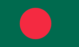
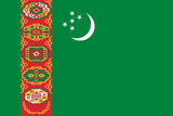
A flag should be simple enough that a child can draw it from memory. The reason is practical: flags are seen at distance, in motion, reversed, and at small scales (down to lapel pin). Bangladesh — green field, red disc — is the textbook good example. Turkmenistan's 1992-1997 design, with its dense vertical stripe of five traditional carpet patterns, was the textbook bad one (and was later simplified).
2. Use Meaningful Symbolism
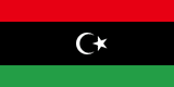
A flag's elements — figures, colors, even arrangement — should connect to the people or institution it represents. Italy's tricolor was lifted from the French Republic and brought to Cisalpine Italy by Napoleon in 1797: the design carries the visual history of republican revolution. By contrast, Libya 1977-2011 — a solid green field — was so abstract it lost all information in grayscale.
3. Use 2-3 Basic Colors
Flag dyeing operates on a limited standard palette: red, blue, green, yellow, white, black. Using more than three colors raises production costs and weakens contrast. The key rule: separate dark colors with light ones, and light with dark. A good flag remains readable in grayscale.
4. No Lettering or Seals
Words betray a flag's purpose. Letters cannot be read at distance, reverse on the back side, vanish at small scale. Seals were designed to be read on paper, up close — they translate poorly to fabric in the wind. The chronic offender is the U.S. state flag tradition: 27 of 50 state flags place a seal on a blue field, making most indistinguishable from a distance.
5. Be Distinctive — or Be Related
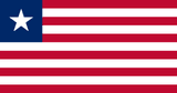
Don't copy other flags, but borrow visual relationships when meaningful. Ghana's Pan-African red-yellow-green ties it to a continental kinship. Liberia deliberately evokes the U.S. flag because the country was founded by freed African-Americans, but differentiates with eleven stripes (for eleven signers) and a single star. Done right, similarity tells a story; done wrong, it makes your flag indistinguishable from Indonesia's and Monaco's.
Exceptions
Five rules, but Kaye notes meaningful exceptions. Colorado's giant "C" works as geometric ornament. Maryland's complex quartered design is so unique it cannot be confused with any other flag. South Africa's six-color flag fuses ANC and post-apartheid palettes into a Y-form that is itself the meaning. The rule for breaking rules: do it deliberately, knowing why.
The original Good Flag, Bad Flag guide is available through NAVA's digital library. This article is a Turkish-first interpretation of Kaye's framework — the examples, structure, and core argument belong to him.